

(Repertório)
I ♥ NY started on an envelope, after another logo had already been approved
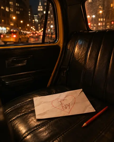
Milton Glaser's first take on I ♥ NY was just the words, and it got approved. A day or two later, in a cab, he sketched the logo that stuck on a small envelope.

Mateus CremonDesigner, Cremon Studio · 3 min read
Before the I ♥ NY everybody knows, a different logo got approved for the same job. The one that stuck came later, on a small envelope, in the back of a cab. Milton Glaser told the story himself in a 2010 interview with CBC Radio.
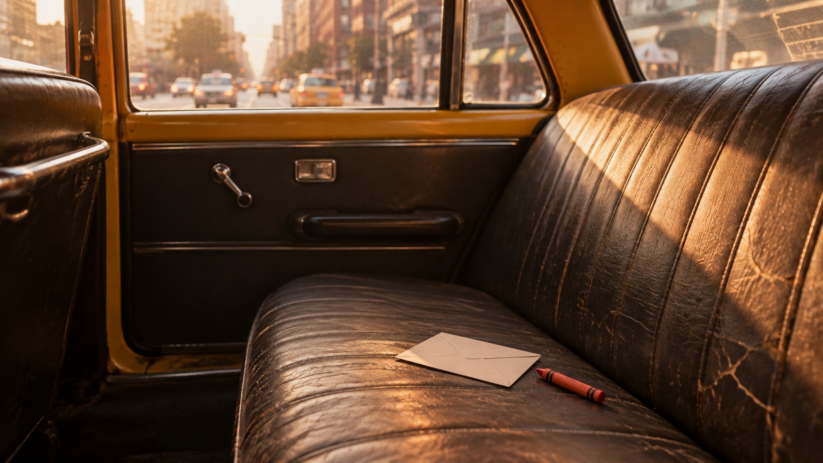
New York, mid-1970s
The city was close to bankruptcy, crime was up, and garbage collectors were on strike. In 2011, Glaser told the Village Voice that he and his wife used to argue about whether it was safe to go out at night.
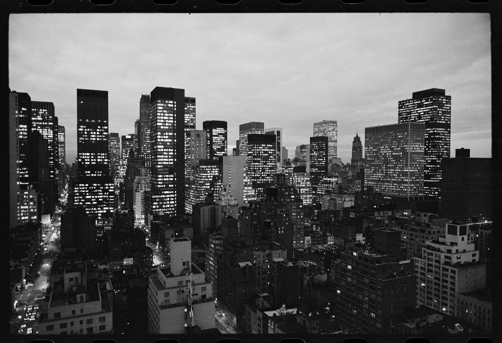 New York at dusk, January 10, 1975. Photo: Thomas J. O'Halloran, U.S. News & World Report/Library of Congress.
Around then, a guy from the state's commerce department, Bill Doyle, walked into Glaser's office. The state wanted tourists back. It already had the line "I Love New York." What it needed was a symbol.
The first version got approved
Glaser sent over a proposal that same week: the phrase spelled out, all type. It got approved.
He wasn't crazy about it himself. He told CBC it was acceptable, but nothing special.
A day or two later, sitting in a cab, he thought: this isn't good. He grabbed a small envelope and sketched a different idea, with a heart where "love" used to be.
The heart came from a memory. According to MoMA, he was thinking of lovers' initials carved into tree trunks, joined by a heart.
Six people to convince all over again
He called Doyle, who didn't want to hear it. The logo was already approved, and getting the six people who had signed off on it back together would be a hassle.
Glaser pushed, and went over to Doyle's office to show him the sketch. Doyle agreed with him. A week later, the six turned down the first version and approved the one from the envelope.
Glaser's own line on it, in that interview: "It just missed not ever coming into existence."
MoMA now holds a 1976 I ♥ NY sketch on an envelope, in red, roughly 2.9 by 3.6 inches.
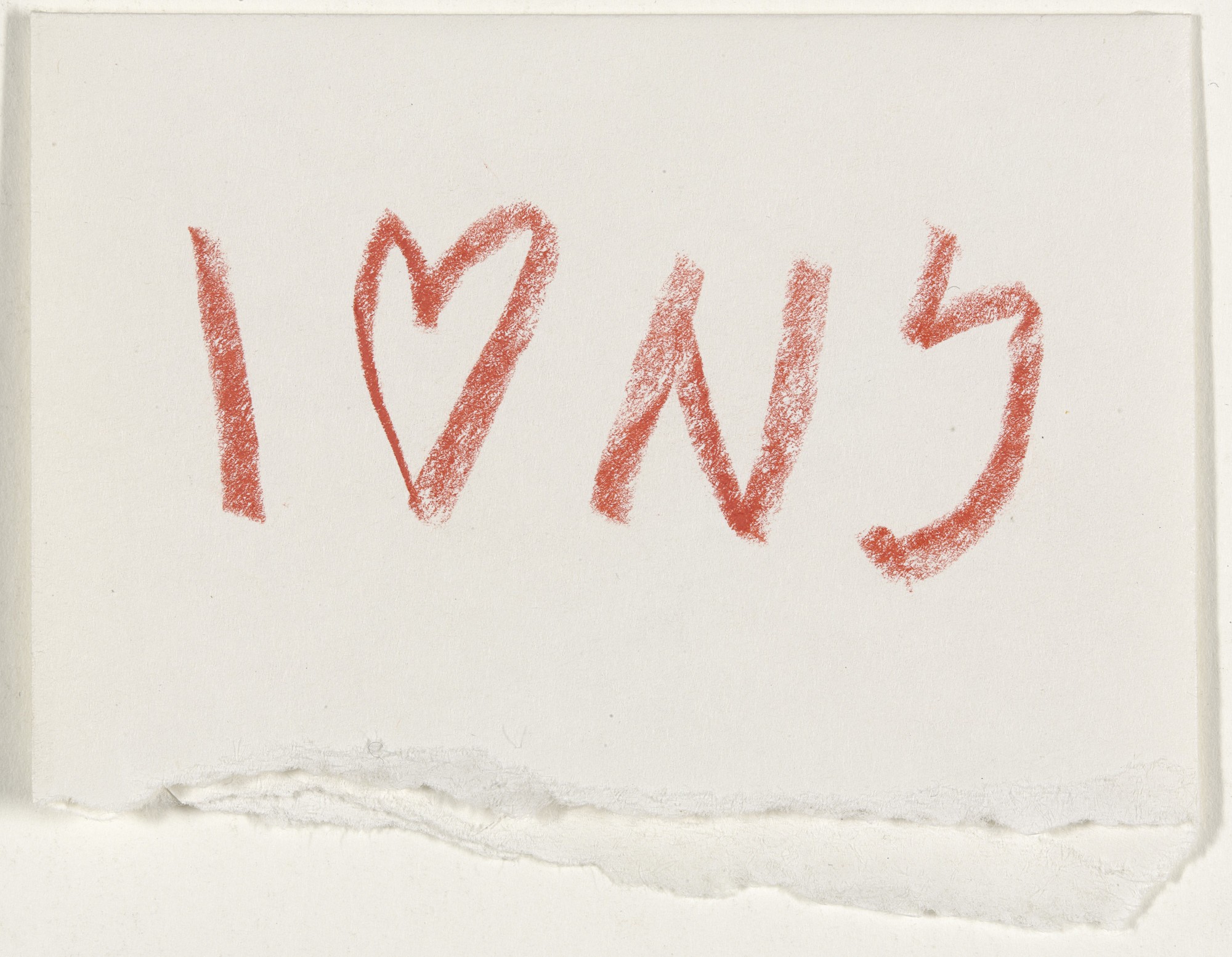 I ♥ NY concept sketch by Milton Glaser, 1976. Ink and tape on envelope, 7.3 x 9.2 cm. Collection of MoMA.
The heart does the word's job
The final lettering is American Typewriter, according to MoMA. To me, though, the heart is what holds the logo together. It takes the place of "love," and you get it at a glance, in any language.
The first version said "I Love New York" too, every letter of it, and it got approved that way. It was missing an idea, and the idea showed up on an envelope.
For free
Glaser did I ♥ NY for free. Today the brand brings the state of New York about $1 million a year in licensing fees, according to a 2023 request for proposals from the state itself. MoMA calls it one of the most recognized and most imitated logos in the world.
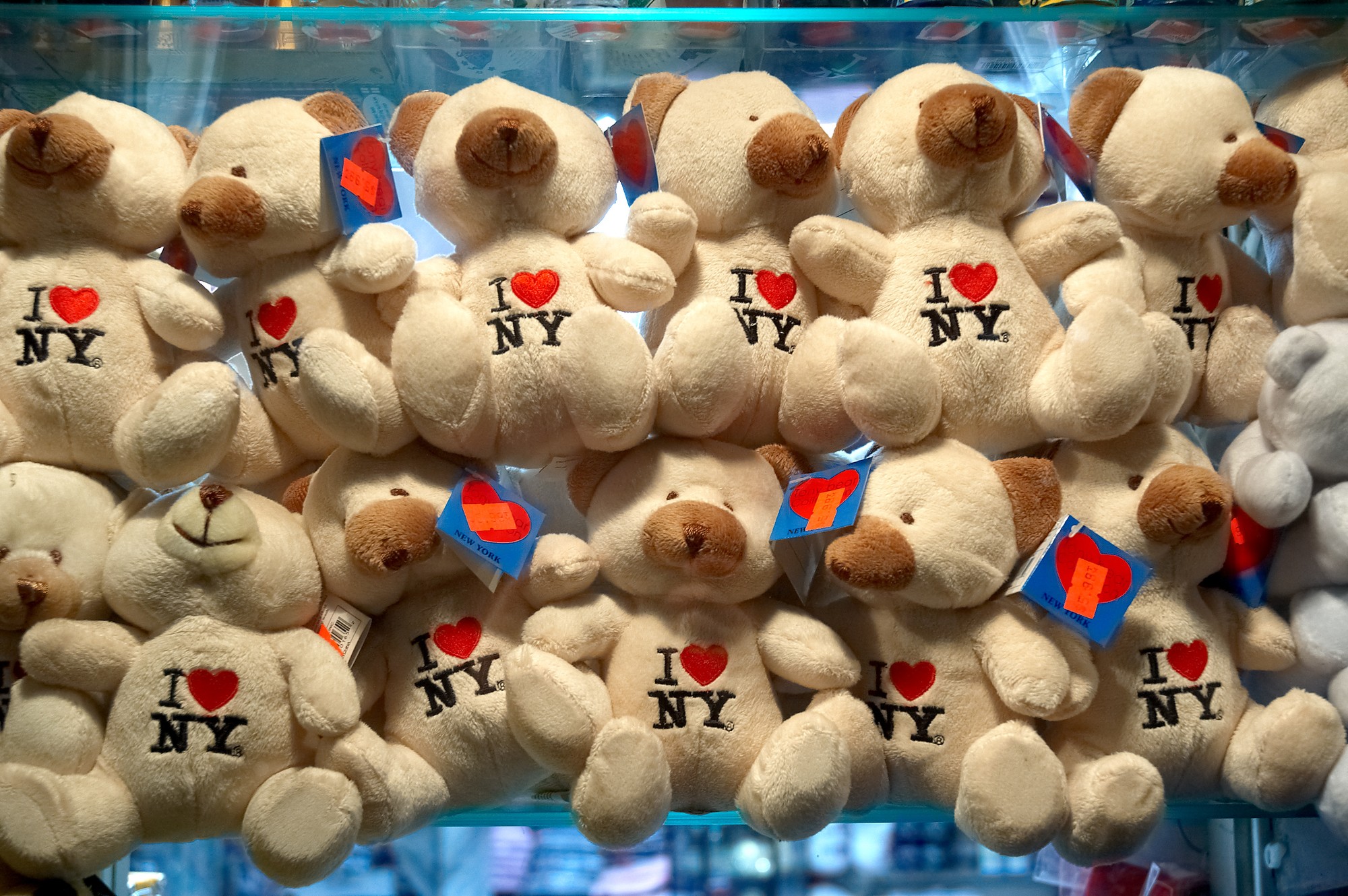 I ♥ NY teddy bears for sale in New York. Photo: Jason Kufer/Wikimedia Commons (CC BY-SA 2.0).
In 2011 he told the Village Voice he didn't miss the millions. What amazed him was how big such a small, simple idea had gotten. He talked about the logo as almost nothing, a few scribbles on a piece of paper.
Where I start
Glaser started with the lettering and got to the idea afterward. I go the other way. Before I think about typefaces, I sketch the idea in a ruled notebook with sand-colored pages.
To me, this story is the best case for starting with a sketch. The all-type version got approved by six people. The one that stuck fit on an envelope.