


(Processo)
The competing practice is one thumb away
Before booking, even referred patients look up the practice's website on their phone. That's where, one tap from the back button, they decide whether to call or go back to Google.

Mateus CremonDesigner, Cremon Studio · 3 min read
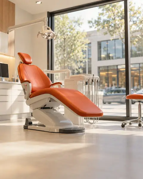
A lot of dental practices have put real care into the office: new chairs, a nice front desk, good coffee. But new patients meet the practice on their phone first. Even people who come in through a referral usually check the Instagram and the website before booking, and on a phone, the practice down the street is one tap of the back button away.
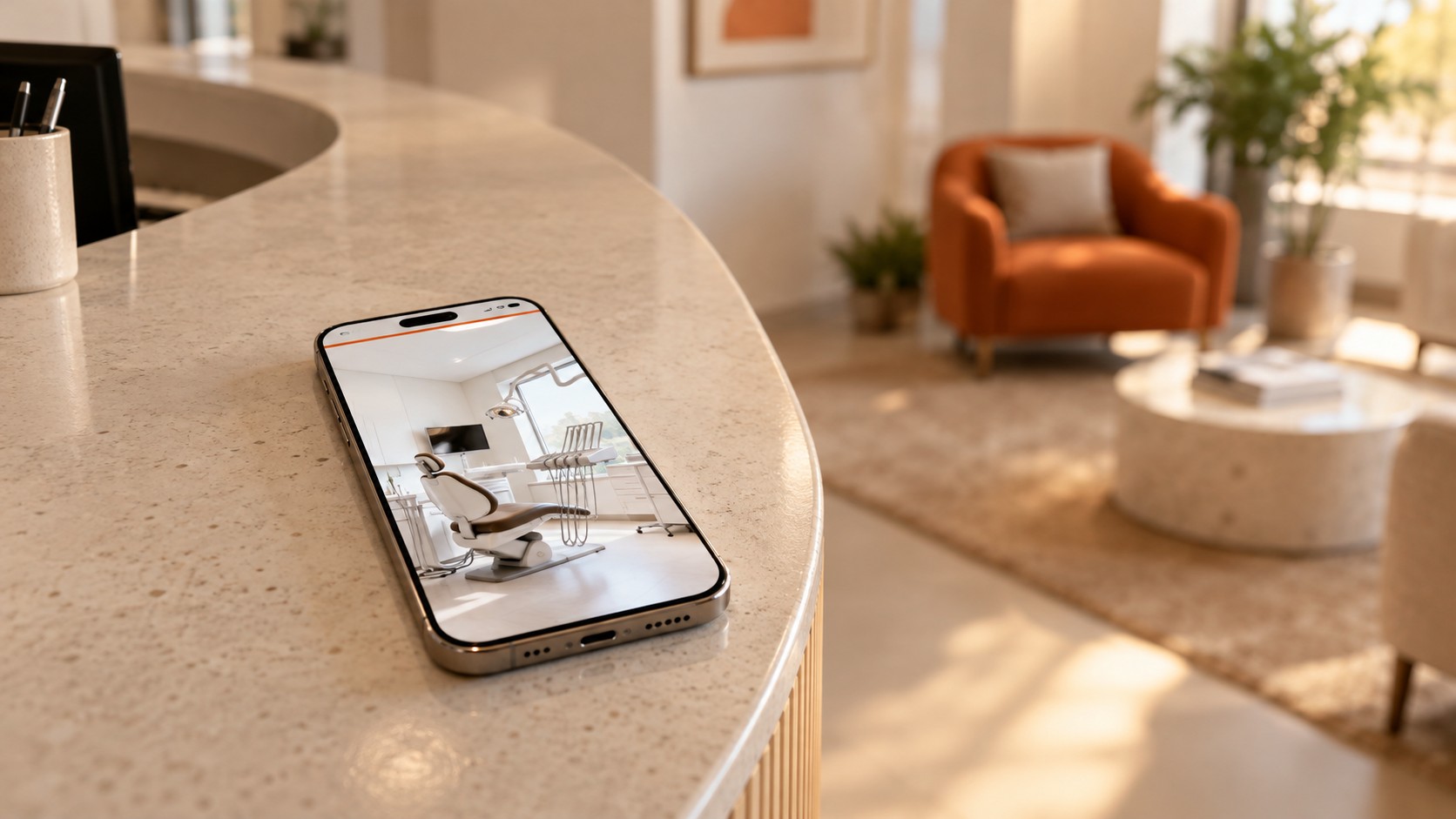
Referrals still count for a lot, and I'm not saying otherwise. But the website is where a patient decides whether to call or go back to Google. So I think a practice's site deserves the same care as the front desk, and that care goes well beyond looks.
What a screenshot won't show
I recently built a new website for a dental practice, with its brand, its video, all 14 treatments and the whole blog. Put the old and new sites side by side and the visual difference is the first thing you notice. What changed most doesn't show up in a screenshot, though. It's in the speed, and in who can actually use the site.
8.4 seconds of waiting
I ran both through PageSpeed Insights, Google's free test. It simulates a phone, a Moto G Power, on a slow 4G connection, which is a lot closer to real life than the office wifi.
On September 28, the old site took 8.4 seconds to show its main image. A new patient sat through all of that before seeing the practice. Its performance score was 52 out of 100.
The weight came from the video at the top. The prettiest part of the site was also the heaviest one for a phone connection.
The video stayed
I didn't cut the video. It got a vertical version made for phones, and it only starts playing after the page loads. The practice shows up first and the video comes right after.
In the same test, on October 2, the main image went from 8.4 seconds to 1.9, and the performance score went from 52 to 95.
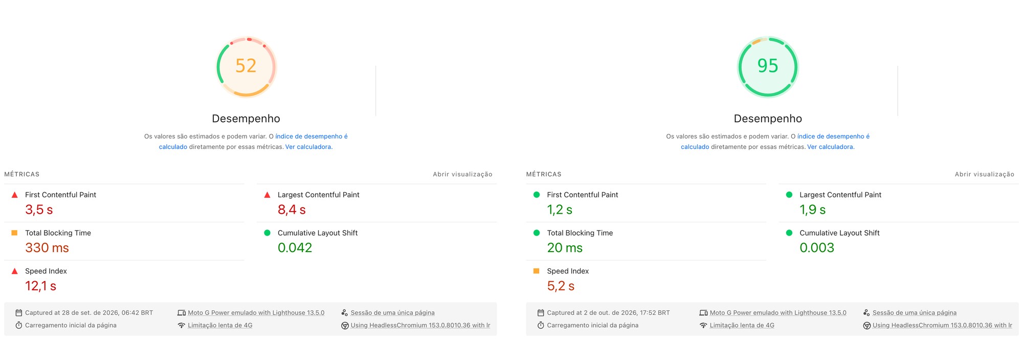 Mobile performance, before (Sept. 28, 2026) and after (Oct. 2, 2026). Screenshots: PageSpeed Insights.
The ramp at the door
The ramp at the front door has a website version: buttons big enough for a thumb, captions on the video, and headings in the right order for people using a screen reader.
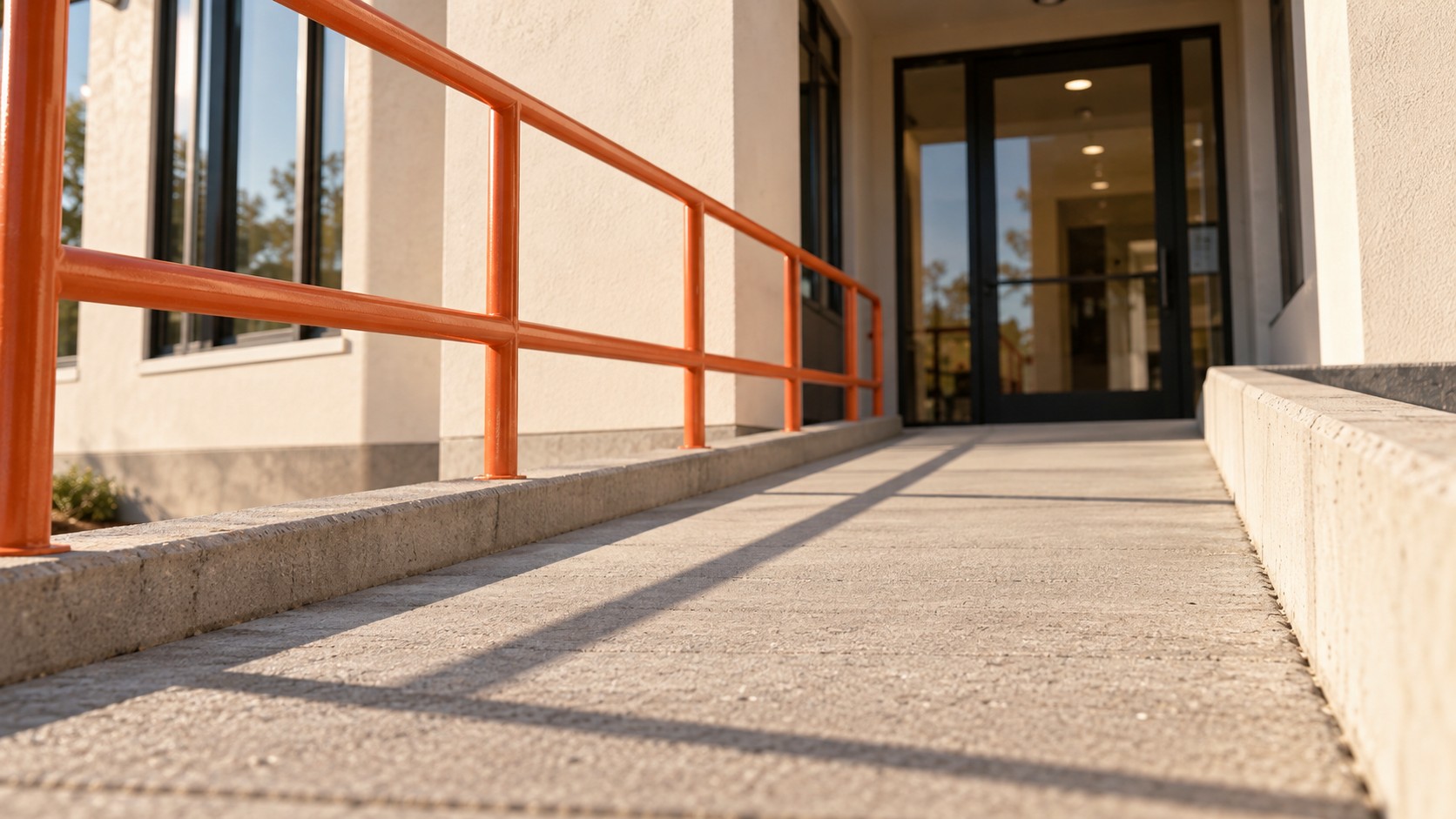
It's also the law. In March 2022, the Department of Justice published guidance saying the ADA covers what businesses open to the public offer on the web, and it names medical offices as an example.
The old site scored 95 for accessibility. That sounds great, and the test still flagged tap targets too small or too cramped for a finger, headings out of order, and a video with no captions track. The report itself warns that automated checks only catch some of the problems.
The new site scored 100 on the same test and passed a second automated test, run on 15 page types, with zero errors.
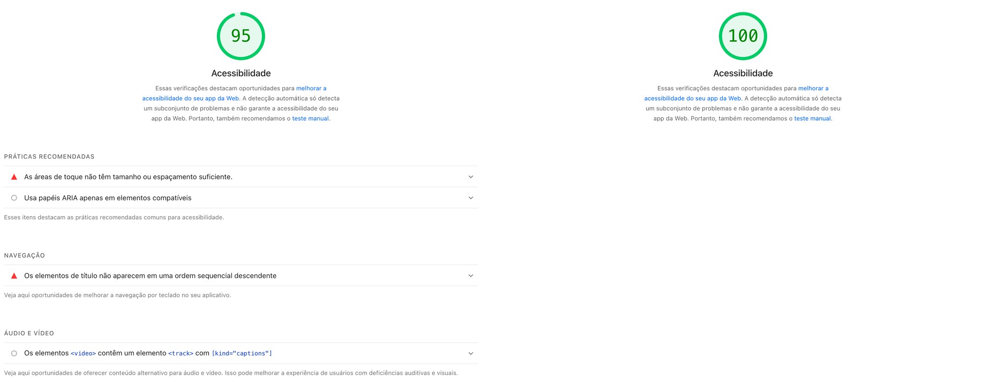 Mobile accessibility, before (Sept. 28, 2026) and after (Oct. 2, 2026). Screenshots: PageSpeed Insights.
Run yours
The test is free at pagespeed.web.dev. Paste in your practice's address and check the mobile tab, since that's where your patients are. If the main image takes forever, the nice front desk only gets seen by people who had already decided to come.
Patients see your website before they ever see your new chair.